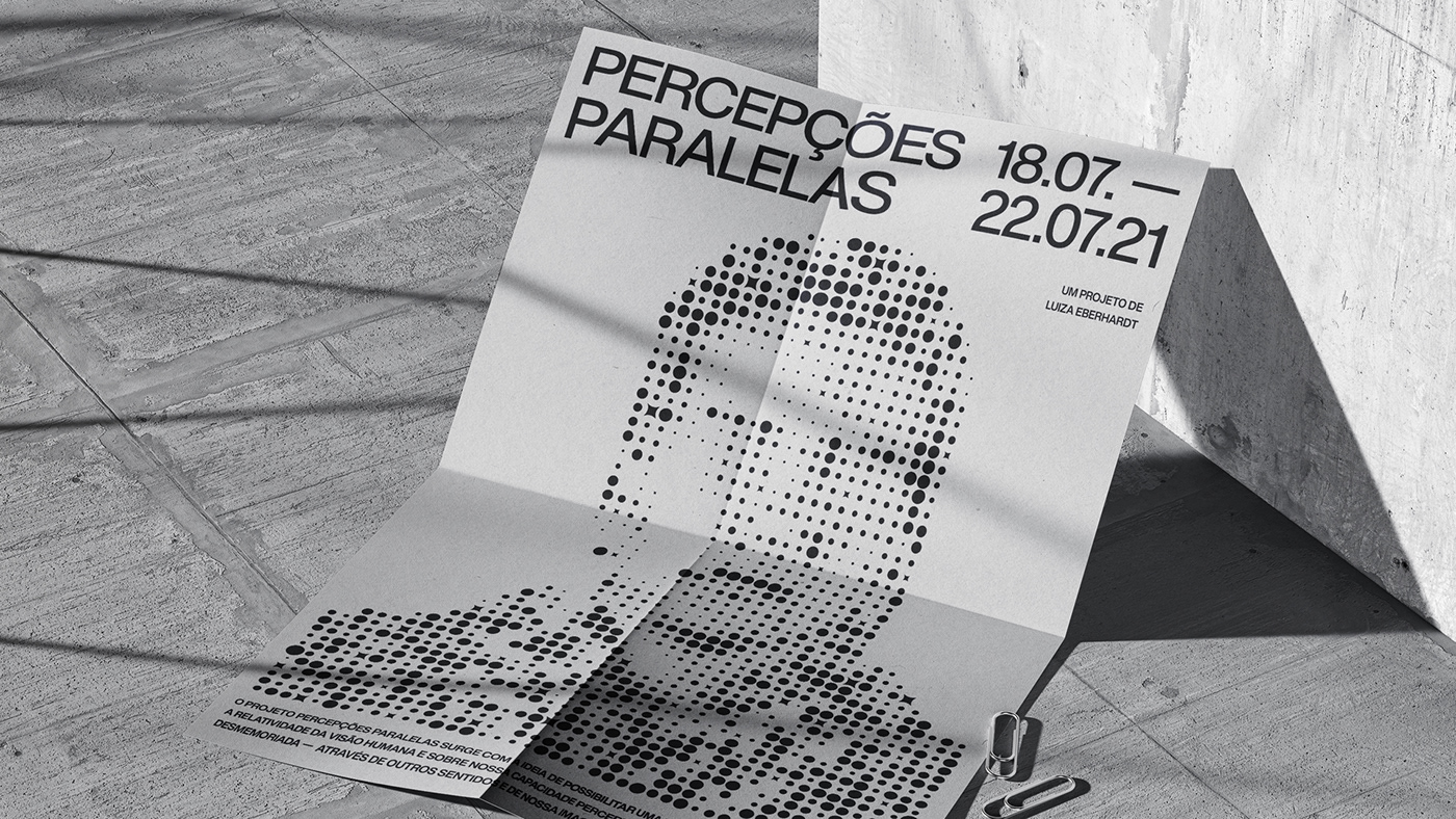
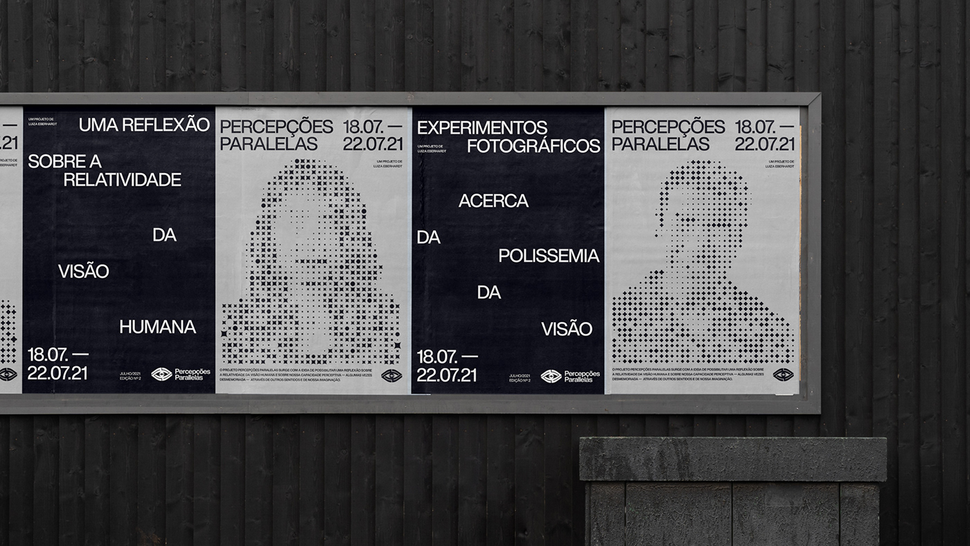
The Percepções Paralelas project aims to enable a reflection on the relativity of human vision and on our perceptive capacity, sometimes forgotten, through other senses and our imagination. Through a photographic experiment carried out by both visually impaired and sighted photographers intentionally deprived of sight, we sought to exercise the perceptive capacity of each one, sharpening the sensory system and imagination.


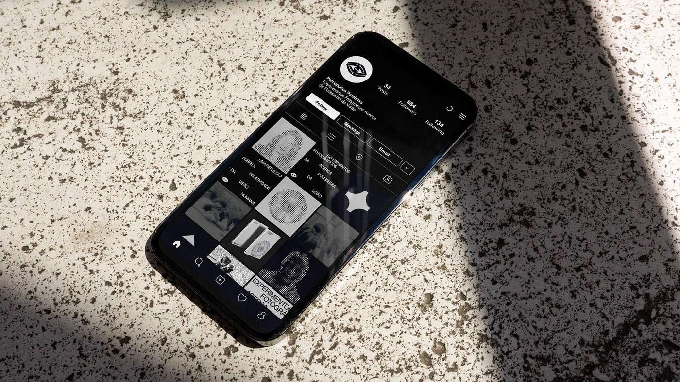
The logo was created based on the idea of the labyrinth, which simultaneously embodies confusion and clarity, chaos and order. The labyrinth represents the path that needs to be taken to find the solution, the light, in the face of the challenge that the project offers its participants.


The graphic elements were inspired by research on visual phenomena and mental processing called phosphene, which is an optical phenomenon characterized by the perception of spots of light when we close or rub our eyes. These patches of light are formed by cells inside the eyes that emit biophotons. Based on the research, we selected photos of the project participants and created a representation of their projection in small particles of light. Each person was designed with a different symbol because each human being has a unique perception that is created within themselves.

In addition to the visual identity of the project, a book was also created documenting the experiment. The book was designed so that both sighted and blind people could enjoy it. For this, a brief description in Braille of each photograph was printed.


